
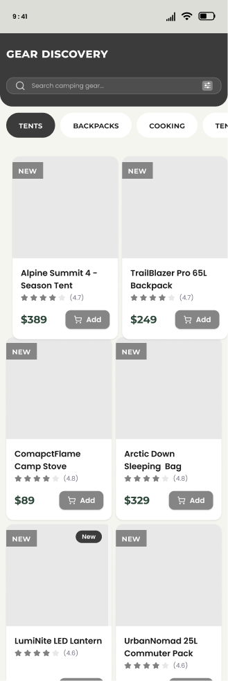
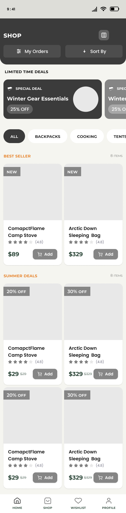
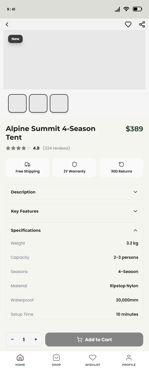
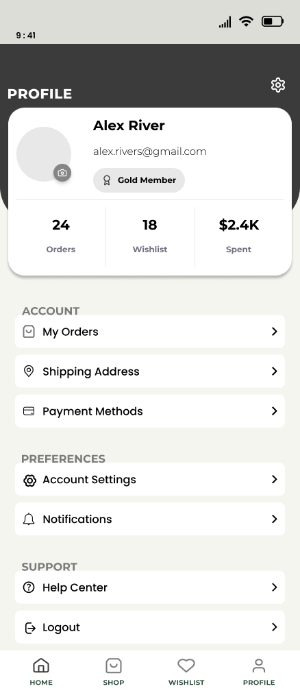
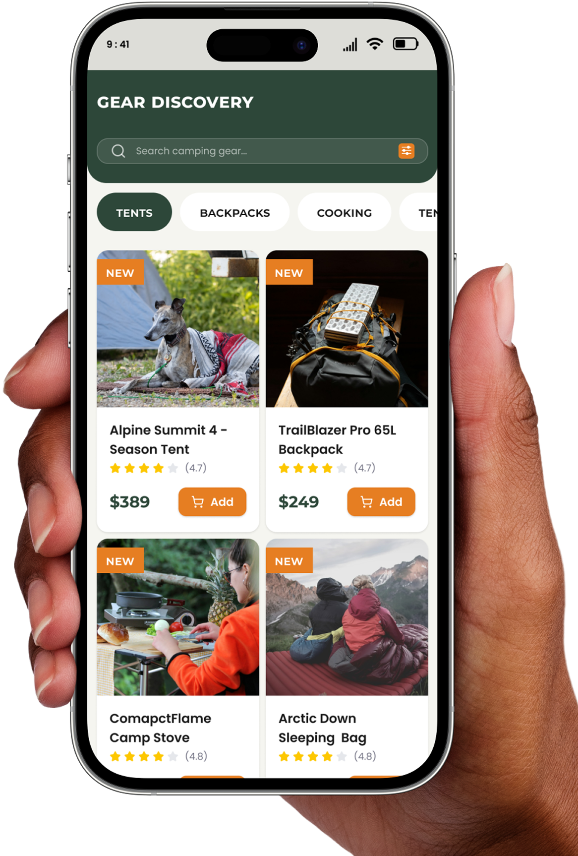
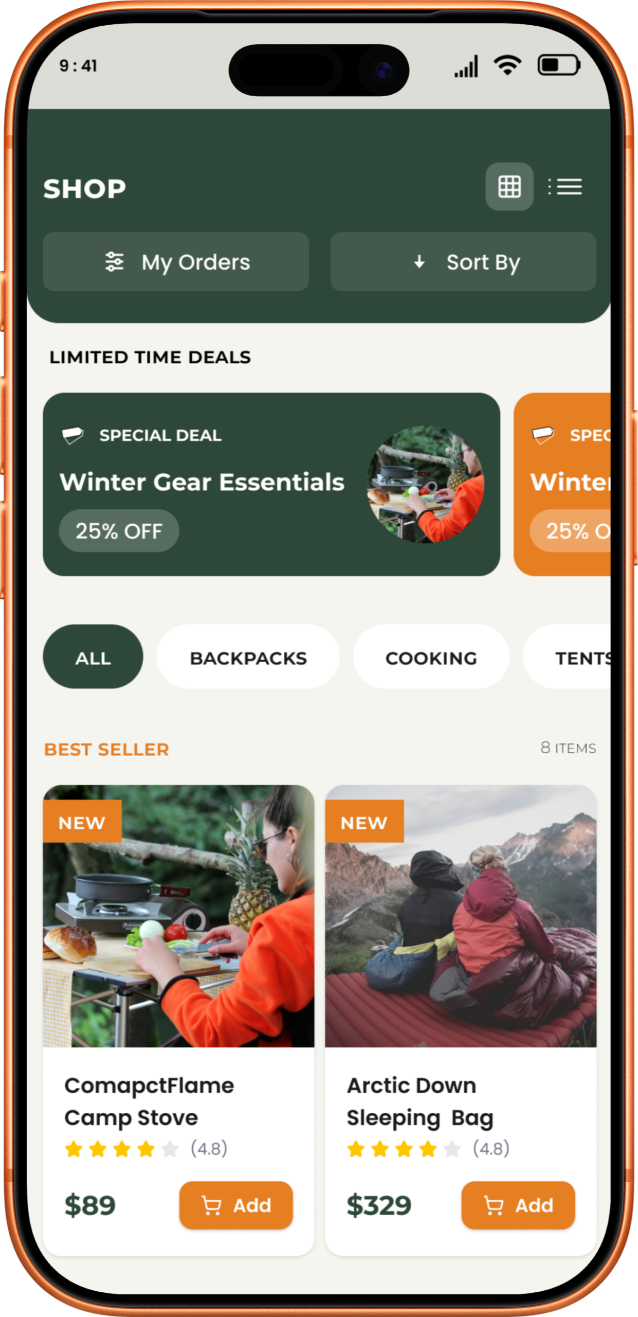
Gear Discovery
Tools
Platform
Industry
Duration
OVERVIEW
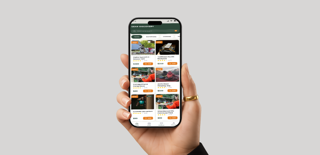
Gear Discovery is a reliable, easy-to-use shopping app and website for people who love camping. I designed it to help hikers find and buy the best outdoor gear, whether they are relaxing at home or standing on a mountain trail.
Problems
Buying technical camping gear is stressful because most apps make it hard to tell if a product is actually right for your trip. Users often feel overwhelmed by confusing technical specs and hidden details, making them afraid of choosing the wrong equipment when their safety depends on it.
Solutions
My Role
UX/UI Designer
My Responsibility
As the Lead UX/UI Designer, I managed the entire design of Gear Discovery. I started with User Research to understand why hikers find buying gear stressful, then used Problem Solving to create a simple, reliable solution. On the UI Design side, I built high-contrast, glove-friendly screens and handled the Information Setup so technical specs are easy to find. Finally, I used Responsive Design to ensure the app works perfectly on both phones and computers, creating smooth Prototyping flows from search to checkout.
UNDERSTANDING THE USERS
User Research
I started by digging deep into our users' habits to uncover what they truly need from a delivery app.
Pain Points
I pinpointed the exact moments where shoppers get frustrated or stuck during their current routines.
Persona
I built a realistic user profile to ensure every design choice remained focused on our target audience.
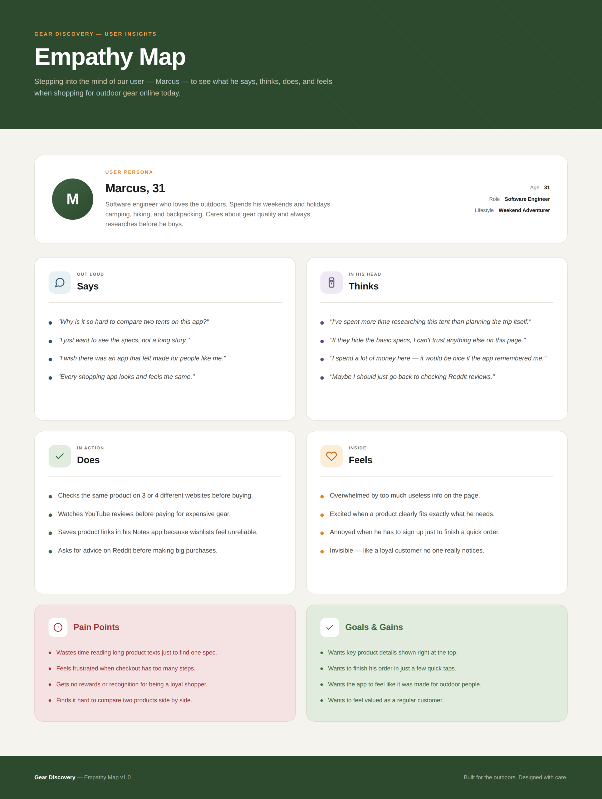
Empathy Map
I mapped out our users' emotional journey to better understand what they think, feel, and do while ordering.
USER RESEARCH
To understand the real-world needs of my users, I started by interviewing hikers and campers about their shopping habits and the frustrations they face outdoors. I found that most users felt overwhelmed by “tech-speak” and complicated data, making it hard for them to know if a product was actually right for their trip. Many also mentioned that typical apps are nearly impossible to use in bright sunlight or while wearing heavy gloves. These conversations showed me that there is a major “trust gap” when buying expensive gear; users are often afraid of making a mistake that could leave them cold or unsafe. These insights led me to focus on creating a high-contrast, simple design that prioritizes clear information and easy navigation, giving hikers the confidence they need to shop anywhere.
PAIN POINTS
1
Users struggle to find and compare technical details like weight, material, and capacity on small screens.
2
Many outdoor enthusiasts look for deals but find them hidden under deep menus or cluttered pages.
3
Standard e-commerce apps often use small fonts that are hard to read in bright outdoor sunlight.
4
Users feel overwhelmed when they have to tap too many times to switch between categories or view their profile.
PERSONA
Kawsar
Alex is a busy professional and weekend hiker who needs a way to quickly find and compare technical gear specs because he wants to ensure his equipment is lightweight and reliable for remote trips.
EMPATHY MAP
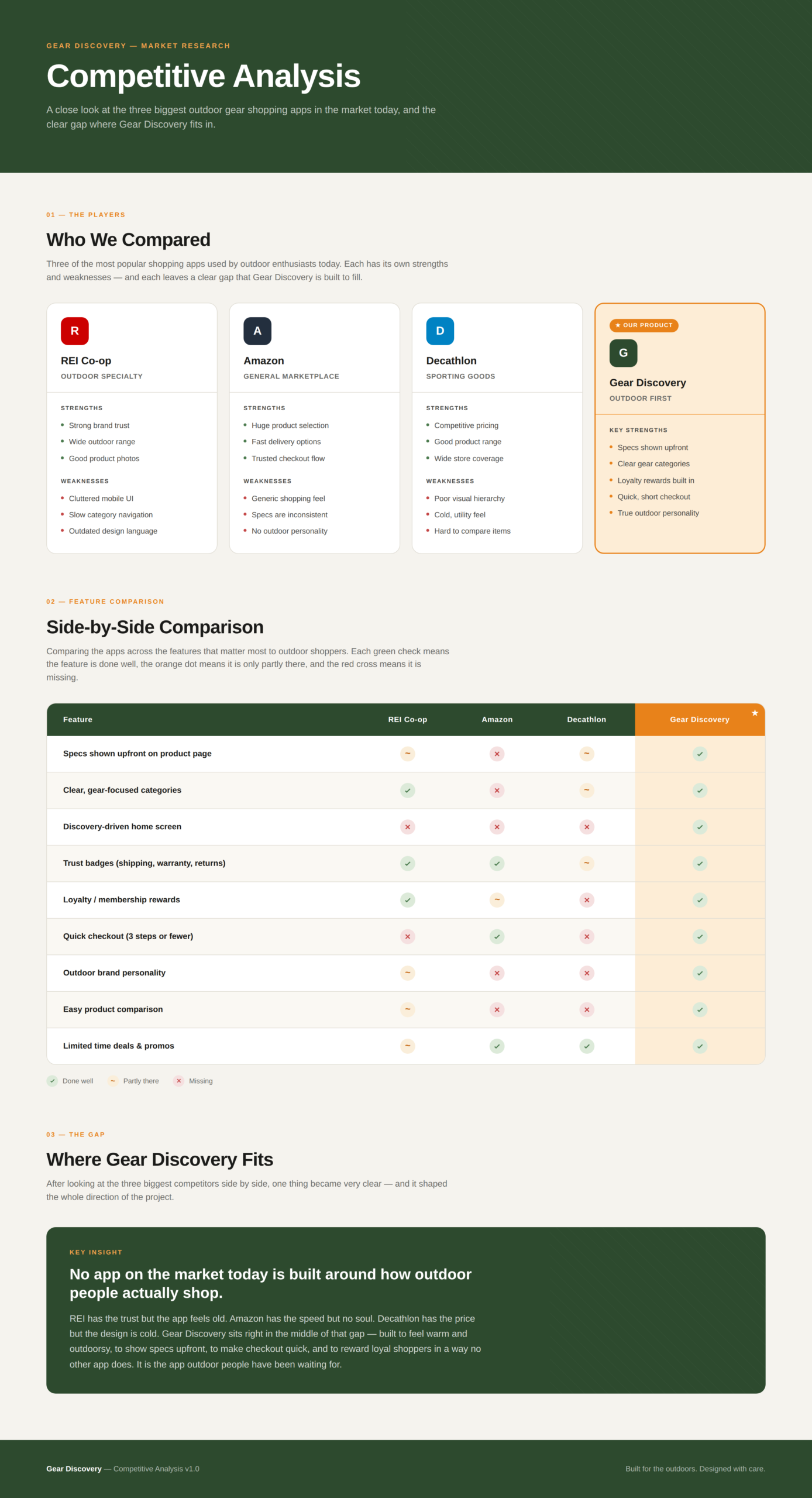
COMPETITOR ANALYSIS
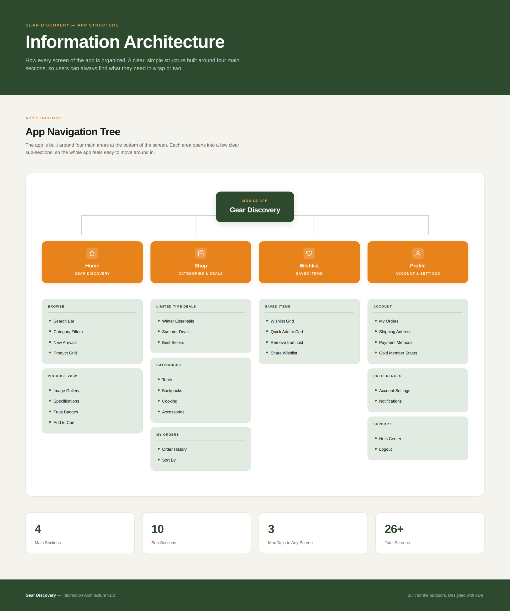
INFORMATION ARCHITECTURE
USER FLOW
MOSCOW TECHNIQUE
STARTING THE DESIGN
User Research
I started by digging deep into our users' habits to uncover what they truly need from a delivery app.
Pain Points
I pinpointed the exact moments where shoppers get frustrated or stuck during their current routines.
Persona
I built a realistic user profile to ensure every design choice remained focused on our target audience.
Empathy Map
I mapped out our users' emotional journey to better understand what they think, feel, and do while ordering.
PAPER WIREFRAMES
DESIGN SYSTEM
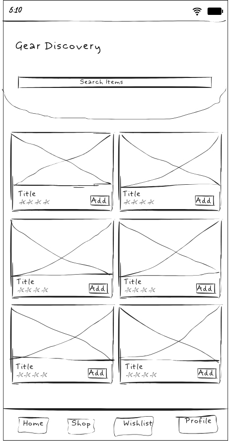
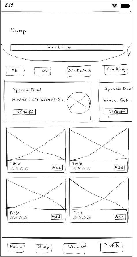
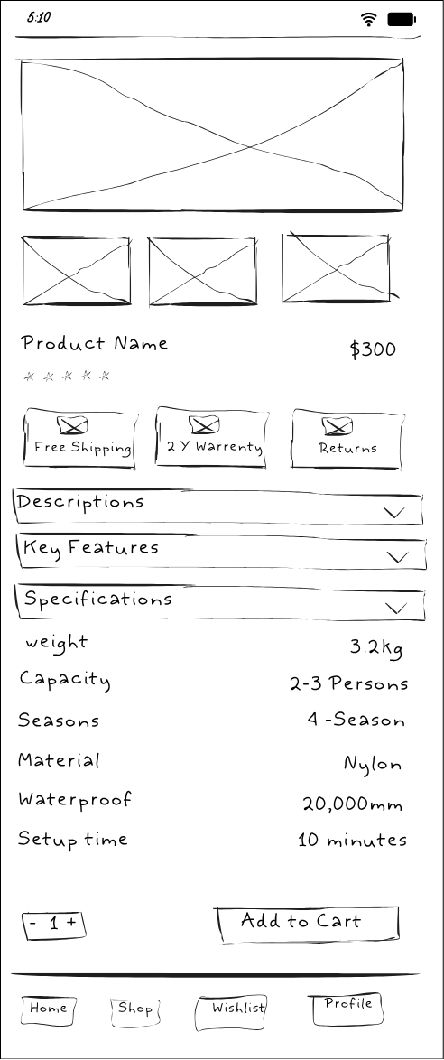
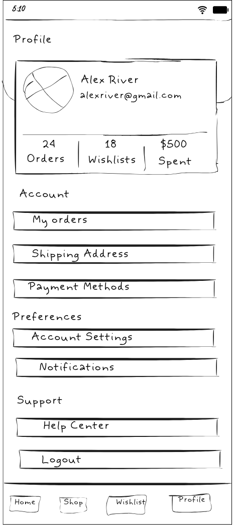
DIGITAL WIREFRAME
MOCKUPS
PROTOTYPE
USABILITY TESTING
IMPACT & TAKEAWAYS
Impact
The final design for Gear Discover turned a stressful, 20-minute search into a 2-minute confident purchase. By focusing on high-contrast visuals and simplified technical data, the app empowers outdoor enthusiasts to trust their equipment before they even reach the trailhead.
What I Learned
Working on this project taught me that a user’s environment is just as important as the app itself. By designing for Rohan’s needs in the bright sun and rain, I realized that high-contrast visuals and simple, everyday words are better than flashy designs or technical jargon. I learned that by focusing on a user’s real frustrations, I can create a faster, stress-free experience that helps people feel confident in their choices