
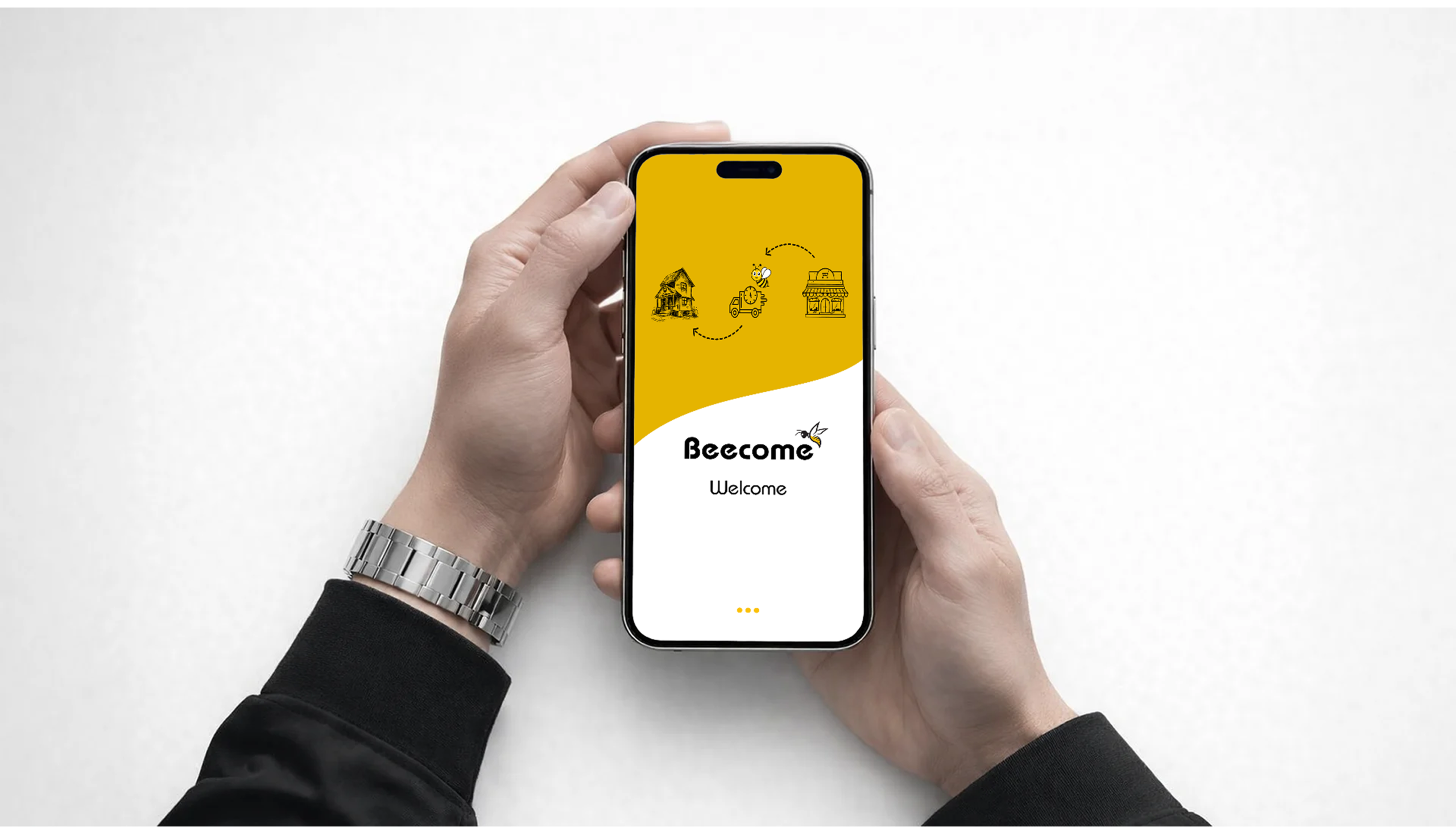
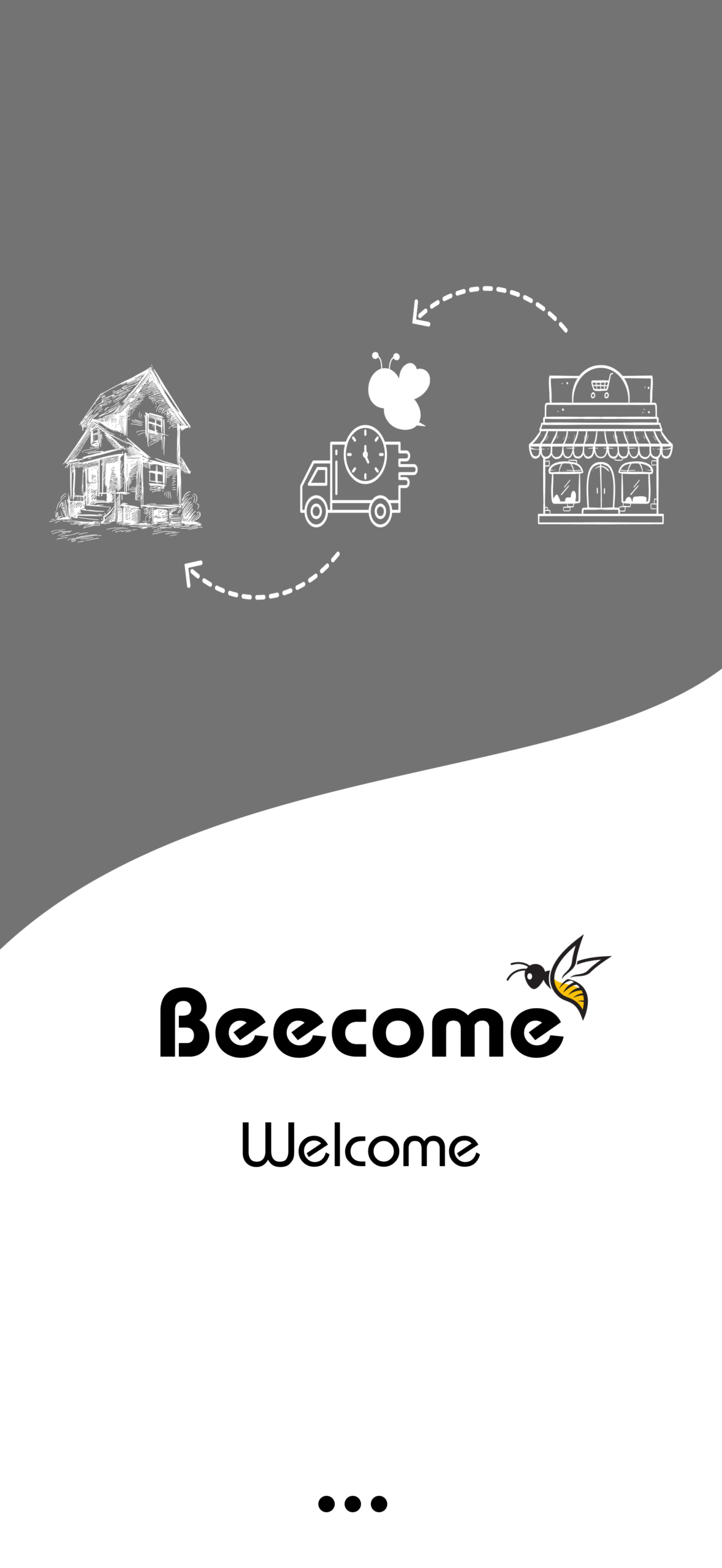
Beecome
Designing a 15-minute grocery delivery experience for Sylhet — where speed meets clarity.
Tools
- Figma
- Adobe XD
Platform
Android & IOS
Industry
Health
Duration
Jan 26 - Mar 26
OVERVIEW
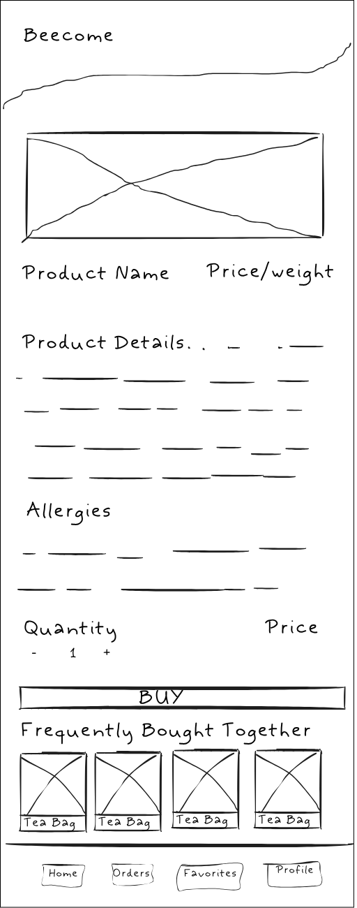
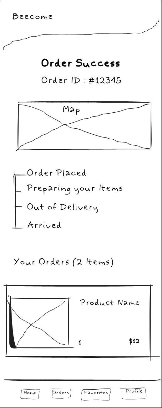
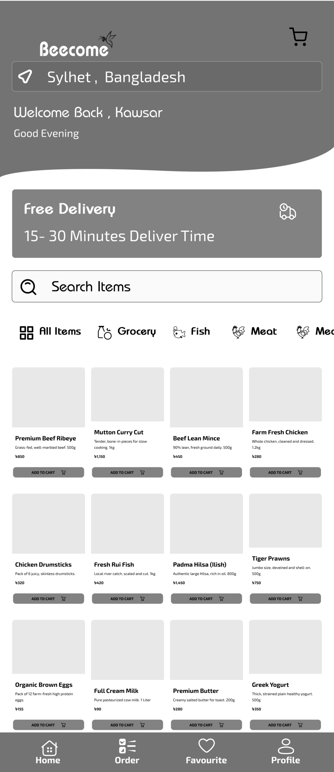
Become is an on-demand grocery and fresh meat delivery app in Sylhet, Bangladesh, promising 15 to 30-minute doorstep delivery. Designed for ultimate convenience, the app features a frictionless “speed-to-checkout” flow, local payment integration like bKash, and real-time map tracking. Its bright, high-contrast yellow UI builds brand trust and makes the daily shopping experience completely effortless.

Problems
Users struggle to quickly order daily groceries and fresh meat on traditional apps due to cluttered navigation, lengthy checkout processes, and a lack of real-time transparency regarding delivery status.
Solutions
To design a fast, high-contrast, and intuitive mobile app experience that simplifies grocery discovery, integrates local payment gateways seamlessly, and provides real-time visual order tracking.
My Role
UI/UX Designer
My Responsibility
Conducting user research, wireframing, designing high-fidelity UI, creating friendly onboarding illustrations, and prototyping for the mobile application.
UNDERSTANDING THE USERS
User Research
I started by digging deep into our users' habits to uncover what they truly need from a delivery app.
Pain Points
I pinpointed the exact moments where shoppers get frustrated or stuck during their current routines.
Persona
I built a realistic user profile to ensure every design choice remained focused on our target audience.
Empathy Map
I mapped out our users' emotional journey to better understand what they think, feel, and do while ordering.
USER RESEARCH
I conducted primary research through user interviews and surveys to understand the pain points of daily grocery shoppers in Sylhet. Before the research, my initial assumption was that a massive product catalog was the most important feature.
However, the data collected revealed a different priority: users cared most about the speed of checkout, transparency of delivery times, and the ability to use local payment methods like bKash easily. They also wanted visual confirmation of their order’s journey.
PAIN POINTS
1
Hello How Are You
2
Hello How Are You
3
Hello How Are You
4
Hello How Are You
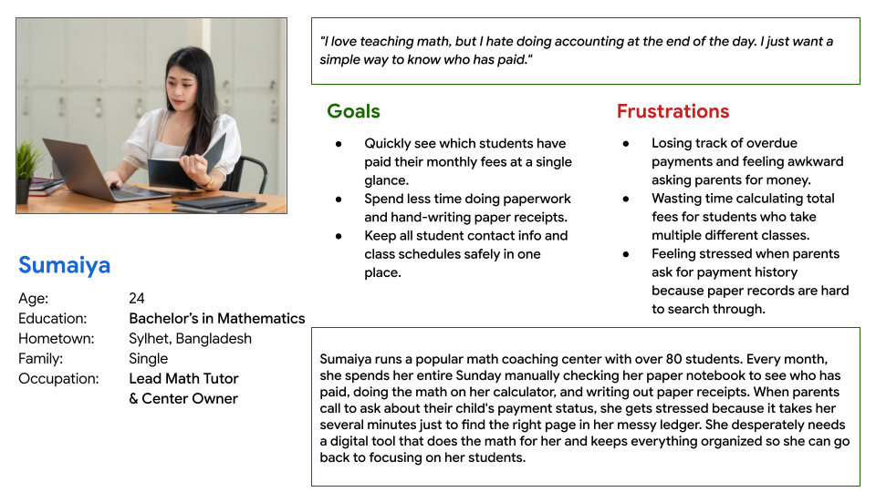
PERSONA
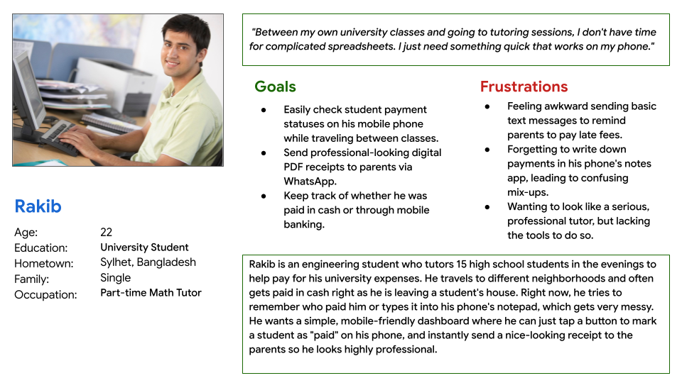
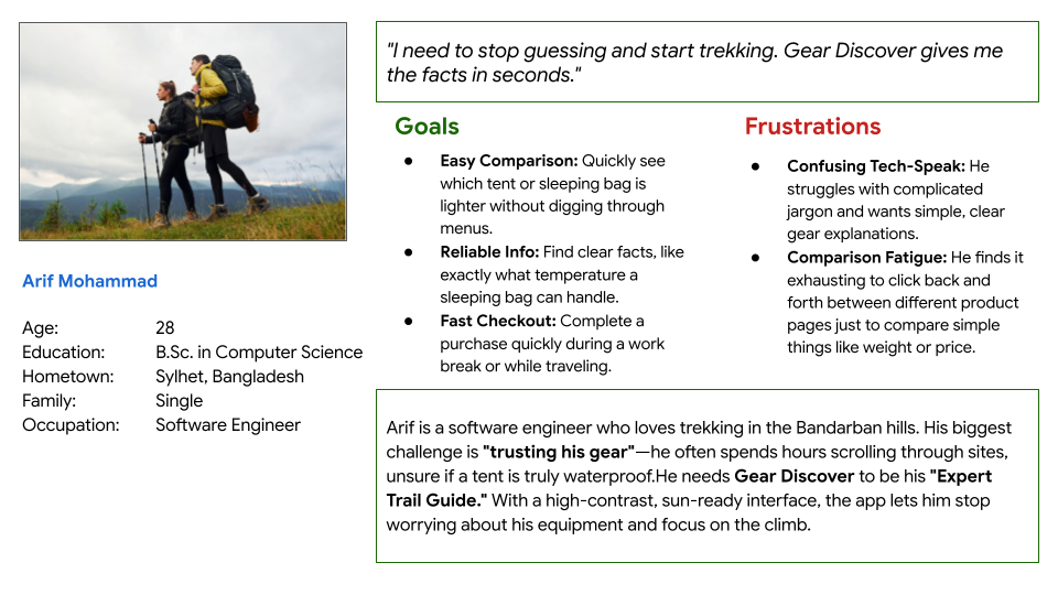
Rahim
Rahim is a busy full-time professional who needs a way to quickly order fresh groceries and meat with ultra-fast delivery because he doesn’t have time to visit the physical market after work and needs reliable tracking to know exactly when his food will arrive.
EMPATHY MAP
COMPETITOR ANALYSIS
INFORMATION ARCHITECTURE
USER FLOW
MOSCOW TECHNIQUE
STARTING THE DESIGN
User Research
I started by digging deep into our users' habits to uncover what they truly need from a delivery app.
Pain Points
I pinpointed the exact moments where shoppers get frustrated or stuck during their current routines.
Persona
I built a realistic user profile to ensure every design choice remained focused on our target audience.
Empathy Map
I mapped out our users' emotional journey to better understand what they think, feel, and do while ordering.
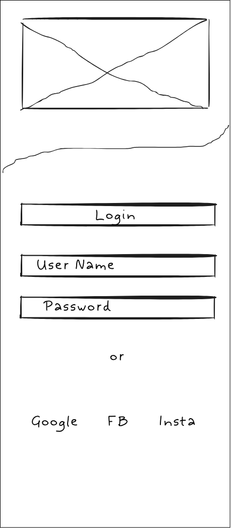
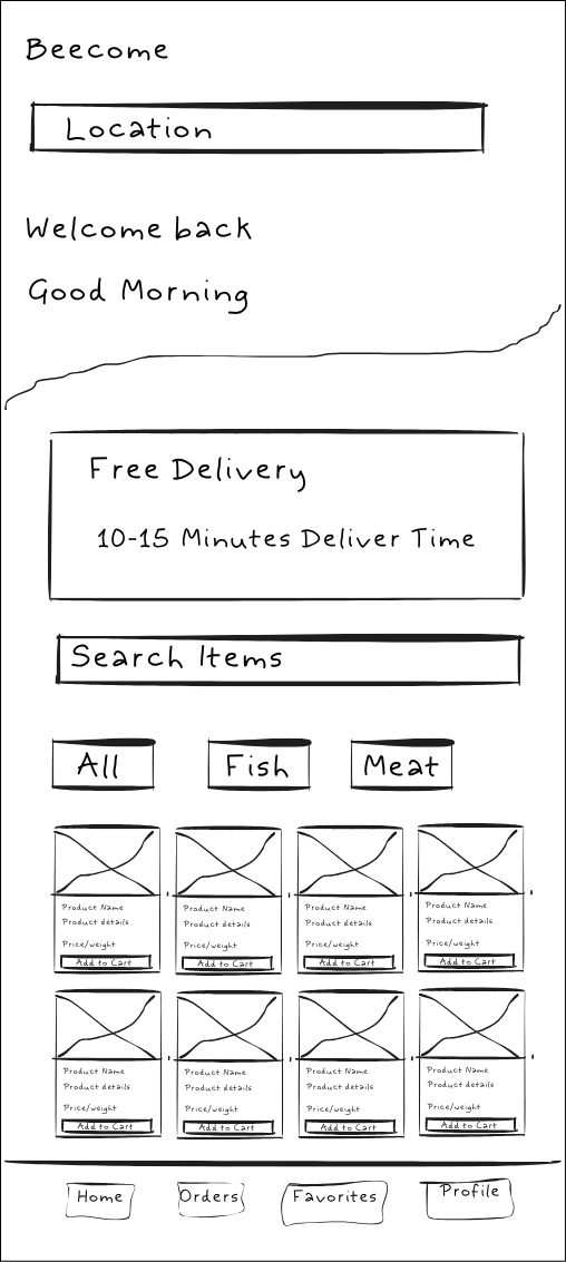
PAPER WIREFRAMES

DESIGN SYSTEM
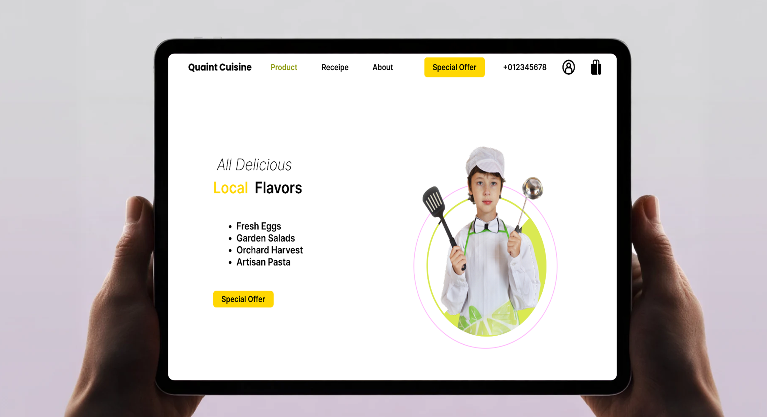
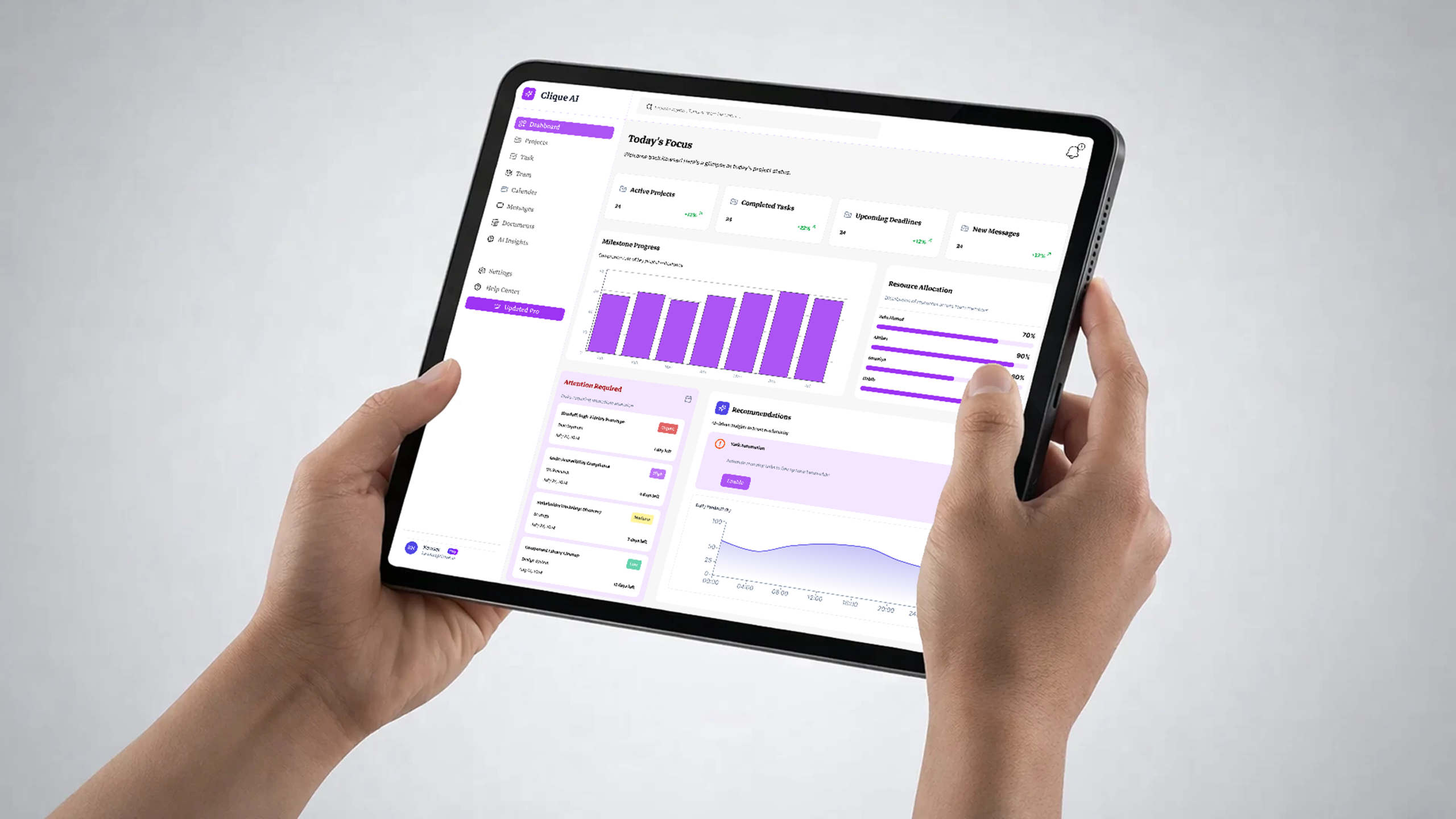
DIGITAL WIREFRAME
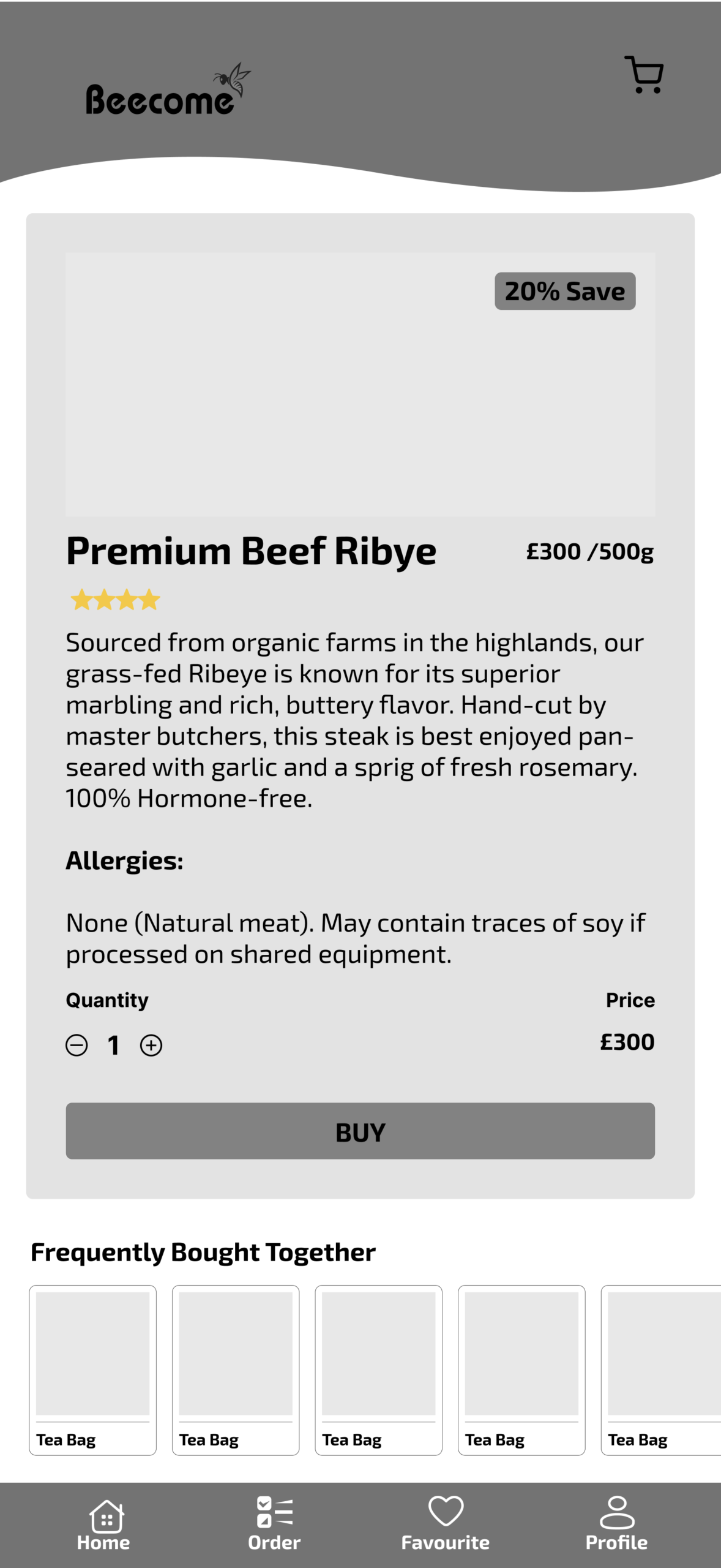
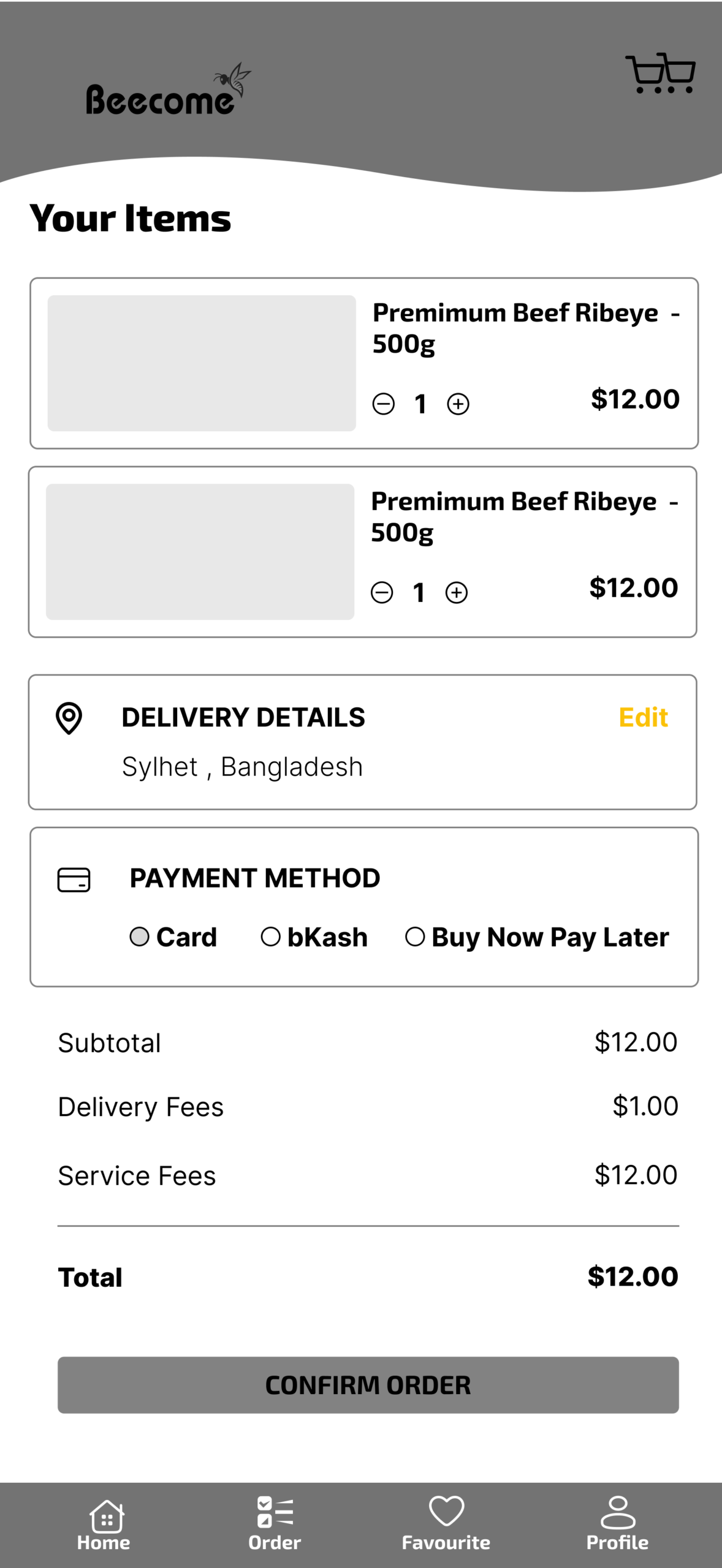
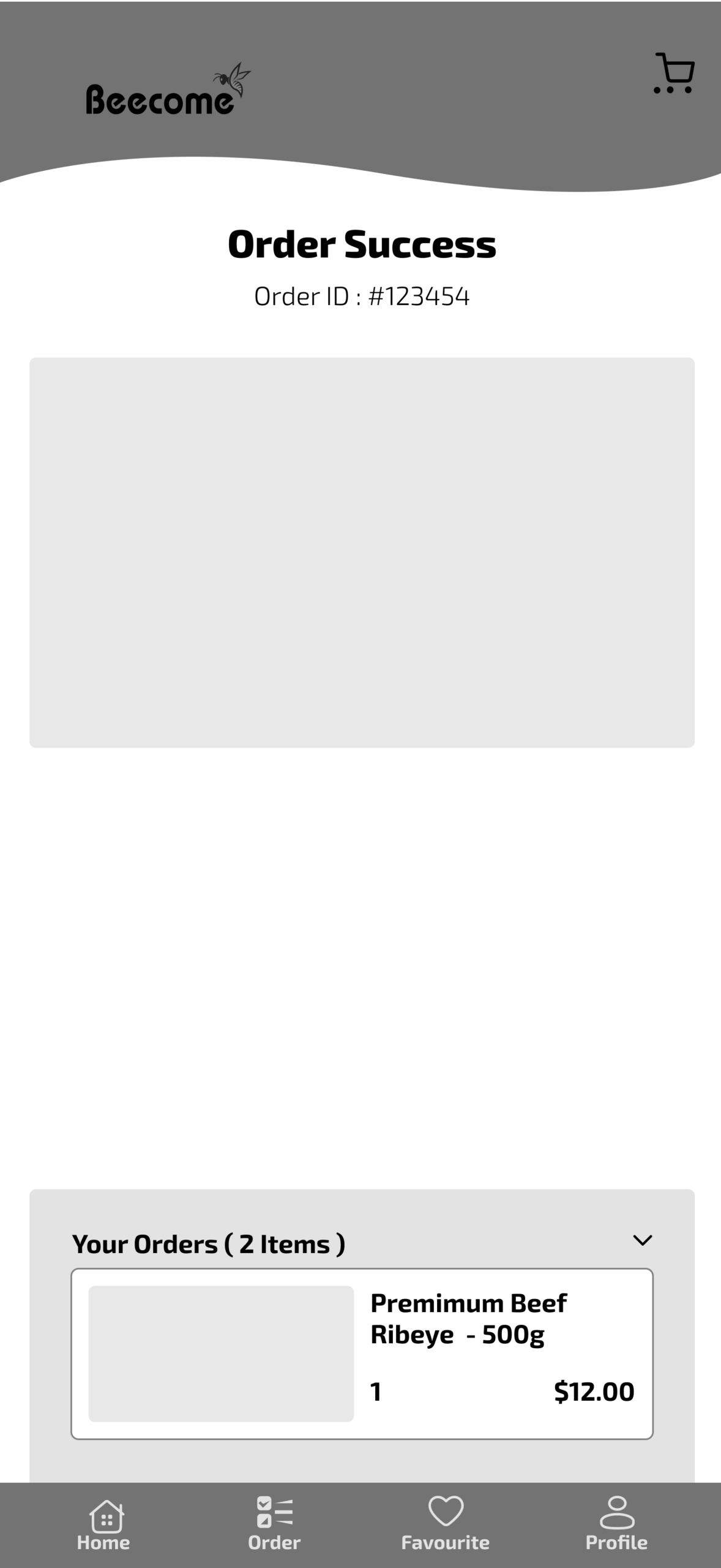
MOCKUPS
PROTOTYPE
USABILITY TESTING
IMPACT & TAKEAWAYS
Impact
The Beecome app design significantly improves the user experience by prioritizing both speed and trust. By organizing items into clean, distinct categories, users can find exactly what they need in seconds, matching the app’s promise of ultra-fast service. Furthermore, simplifying the checkout flow and integrating familiar local payment options like bKash directly targets cart abandonment, leading to faster, more successful transactions. Post-purchase, the addition of a real-time delivery map and clear timeline removes the guesswork, giving users peace of mind and ultimately building long-term customer trust.
What I Learned
Designing Beecome taught me that an app’s interface must mirror its core service; since the brand promises rapid 15-minute delivery, the user journey had to feel equally fast, teaching me how to intentionally minimize taps and eliminate visual clutter. I also learned that localization is critical to a product’s success—a beautiful design falls flat if users can’t easily pay, making the integration of regional methods like bKash just as important as the UI itself. Finally, working with a dominant, vibrant brand color like yellow helped me refine my skills in visual hierarchy and contrast to ensure the app remains accessible and highly readable.
Future Plan
sfsdaaaaaaaaaaaaa
Challenges Overcome
sdfaaaaaaaaasdfads