
Tutor Dashboard
Tools
Platform
Industry
Duration
OVERVIEW
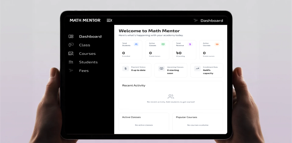
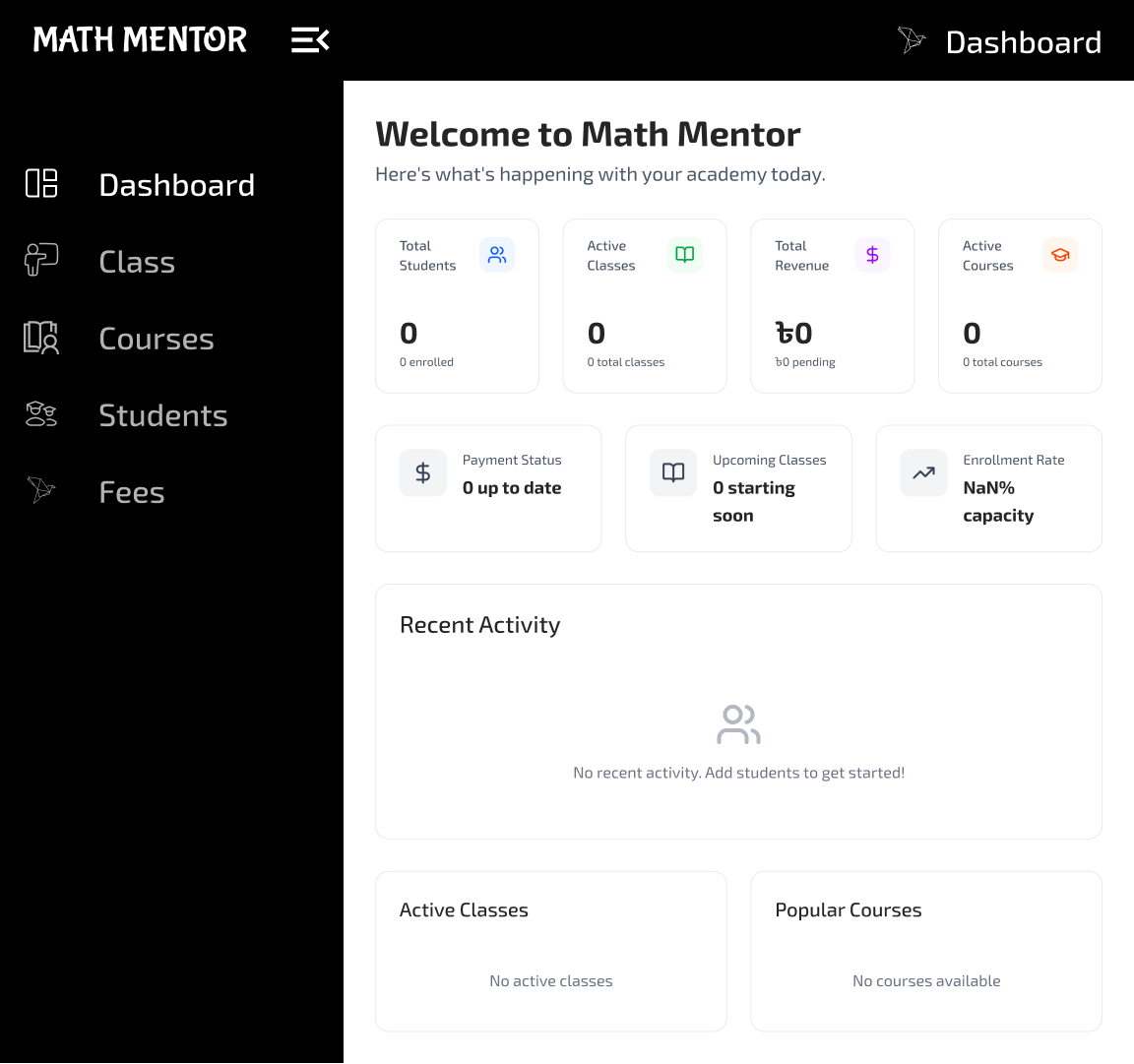
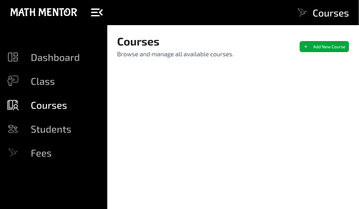
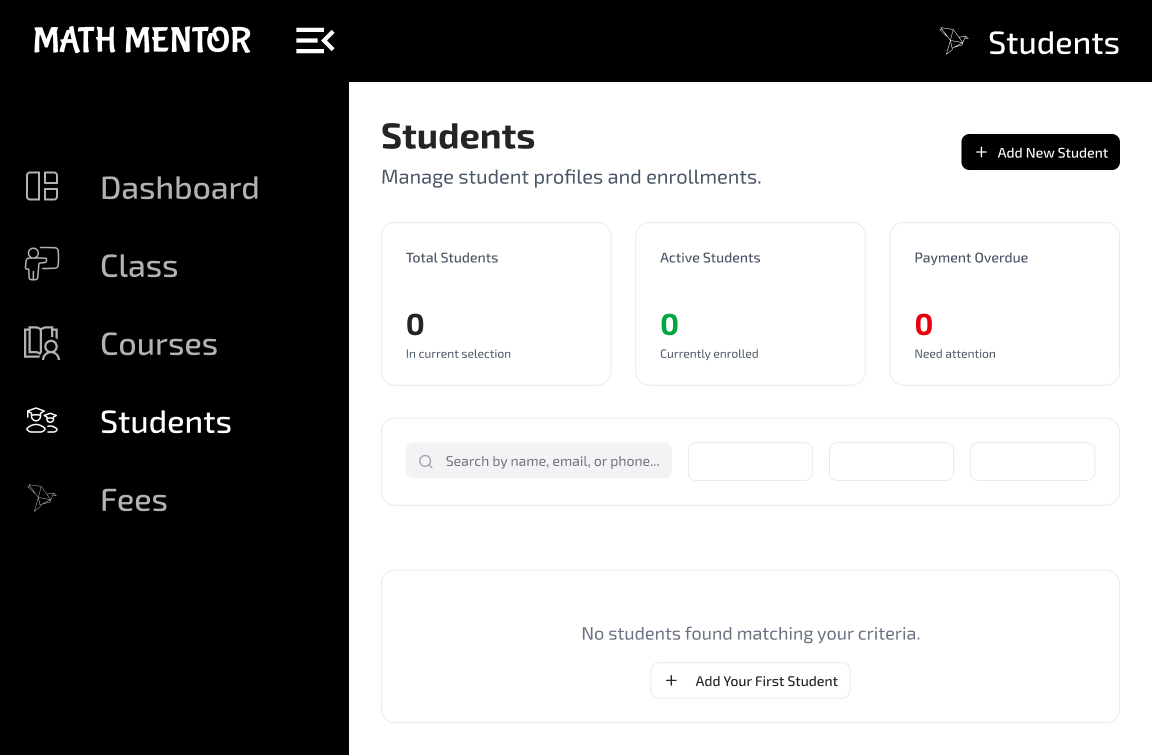
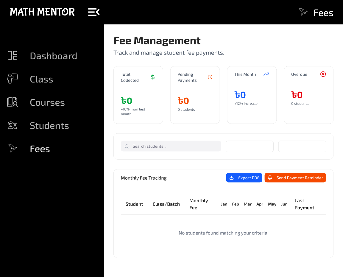
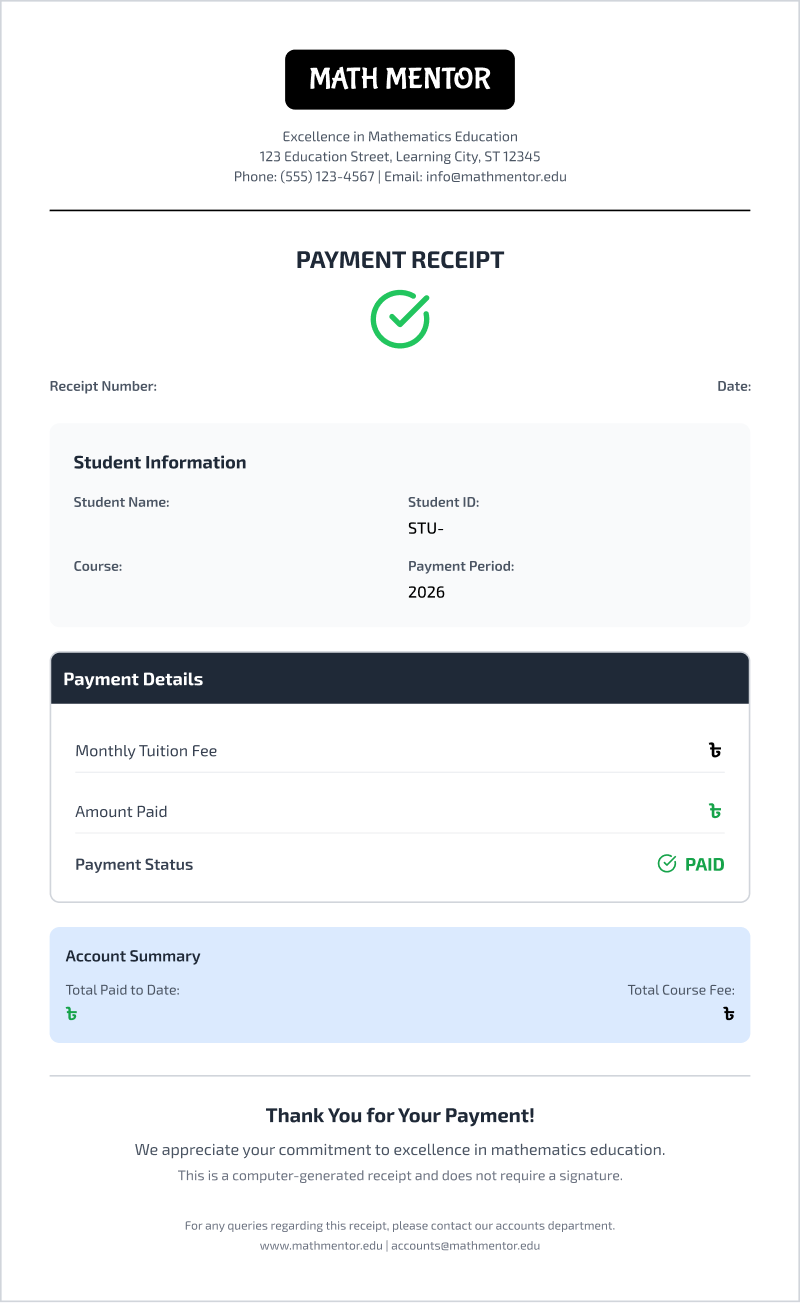
Easy Tutor Dashboard is a cloud-based web application designed to help private math tutors and coaching centers move away from messy paper records. It provides a clean, simple space to manage student profiles, organize class schedules, and keep track of course details all in one place. Beyond basic management, the dashboard acts as a smart financial assistant. It automatically calculates monthly fees based on the courses a student takes and tracks payment statuses using an easy-to-read, color-coded grid. It also generates professional digital receipts and creates printable PDF reminders for overdue payments. By handling these daily administrative tasks, the app saves teachers hours of manual work so they can focus on what they do best: teaching.
Problems
Many math tutors and small coaching centers still rely on messy paper notebooks or confusing spreadsheets to run their daily operations. As the number of students grows, this manual approach takes up valuable time and causes real frustration. Teachers often lose track of who is enrolled in which course, struggle to calculate fees for students taking multiple classes, and find it difficult to know exactly who is overdue for their monthly payments. On top of that, hand-writing receipts and manually tracking down late payments adds unnecessary stress to a teacher’s already busy day.
Solutions
My Role
Lead UI/UX Designer
My Responsibility
As the lead designer for this project, my main responsibility was to turn the complicated task of managing students and fees into a simple, easy-to-use experience. I started by mapping out clear user journeys so teachers can easily navigate daily tasks, like adding new students or checking payment statuses. For the visual design, I focused on creating a clean, modern interface featuring a professional sidebar and an intuitive, color-coded payment grid that highlights paid and overdue fees at a single glance. I also designed the layout for the professional digital receipts and payment reminders. Throughout the process, I made sure the entire dashboard was fully responsive, ensuring it is just as easy to tap and navigate on a mobile phone as it is on a large computer screen.
UNDERSTANDING THE USERS
User Research
I started by digging deep into our users' habits to uncover what they truly need from a delivery app.
Pain Points
I pinpointed the exact moments where shoppers get frustrated or stuck during their current routines.
Persona
I built a realistic user profile to ensure every design choice remained focused on our target audience.
Empathy Map
I mapped out our users' emotional journey to better understand what they think, feel, and do while ordering.
USER RESEARCH
To understand what teachers really needed, I conducted one-on-one interviews with private math tutors and managers of small coaching centers. Going into these conversations, I assumed their biggest challenge would be organizing class schedules or managing student grades. However, talking to them completely changed my perspective. I quickly learned that teaching wasn't the hard part—managing the money was. Their biggest daily frustration was tracking who had paid their monthly fees and who was falling behind, especially when students were enrolled in multiple different classes at once. They were wasting hours digging through messy paper notebooks to find old payment records and writing out paper receipts by hand. This research shifted my entire focus for the project, showing me that the dashboard needed to prioritize a simple, highly visual way to track finances and automate paperwork.
PAIN POINTS
PERSONA
EMPATHY MAP
COMPETITOR ANALYSIS
INFORMATION ARCHITECTURE
USER FLOW
MOSCOW TECHNIQUE
STARTING THE DESIGN
User Research
I started by digging deep into our users' habits to uncover what they truly need from a delivery app.
Pain Points
I pinpointed the exact moments where shoppers get frustrated or stuck during their current routines.
Persona
I built a realistic user profile to ensure every design choice remained focused on our target audience.
Empathy Map
I mapped out our users' emotional journey to better understand what they think, feel, and do while ordering.
PAPER WIREFRAMES
No paper wireframes gallery found.
DESIGN SYSTEM
DIGITAL WIREFRAME

MOCKUPS
PROTOTYPE
USABILITY TESTING
IMPACT & TAKEAWAYS
Impact
The Easy Tutor Dashboard completely changed how local tutors manage their daily tasks, saving them hours of frustrating paperwork every week. One teacher during our testing session shared, “For the first time, I actually know exactly who has paid me without having to spend my entire Sunday doing math.”
What I Learned
While working on this project, I learned that when people are dealing with money and numbers, the design needs to be as simple and clear as possible. I realized that a good interface doesn’t need to be fancy or complicated; sometimes, a simple color-coded grid and a one-click receipt button solve the user’s biggest problems perfectly. This project taught me to always think about the user’s real-life environment—like a teacher feeling rushed between classes—and design tools that are fast enough to keep up with them.