
Clique AI
Tools
Platform
Industry
Duration
OVERVIEW
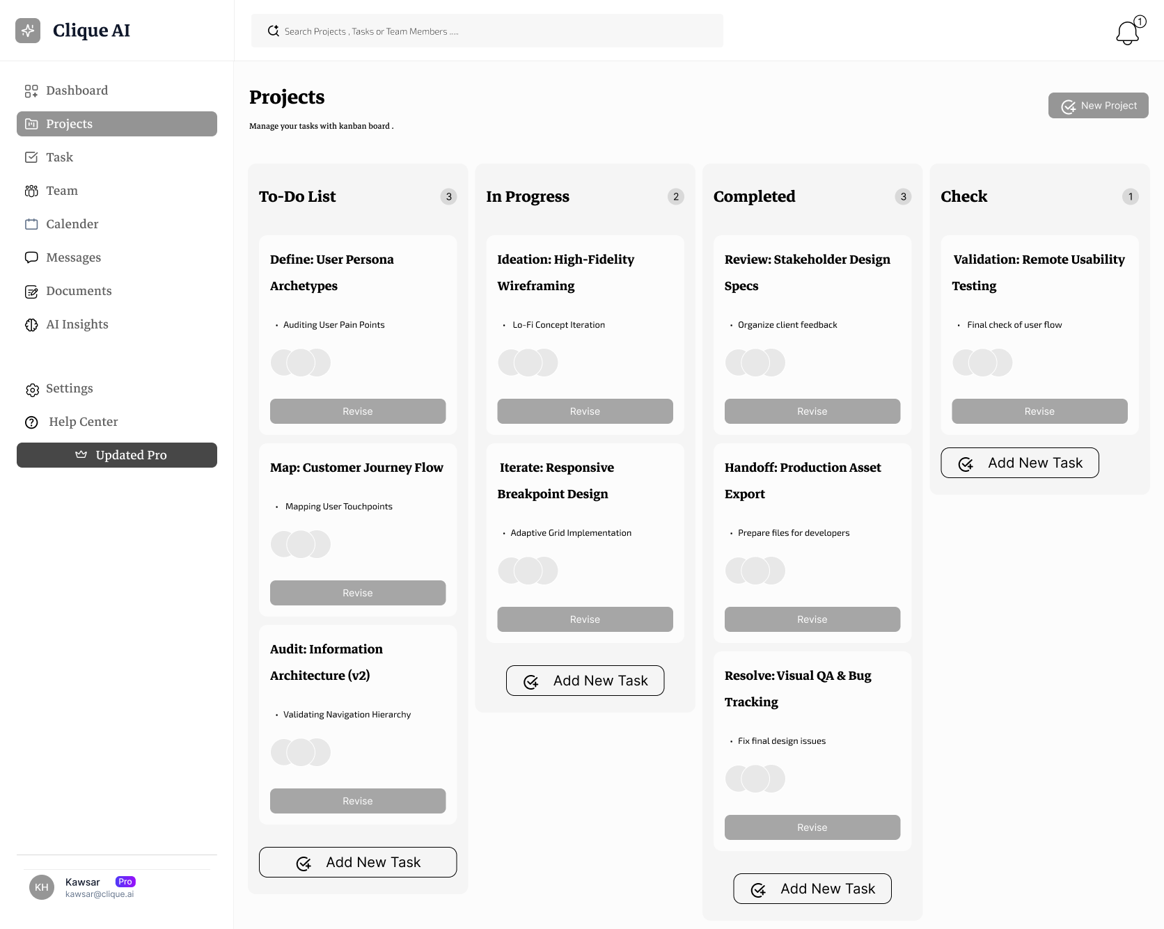
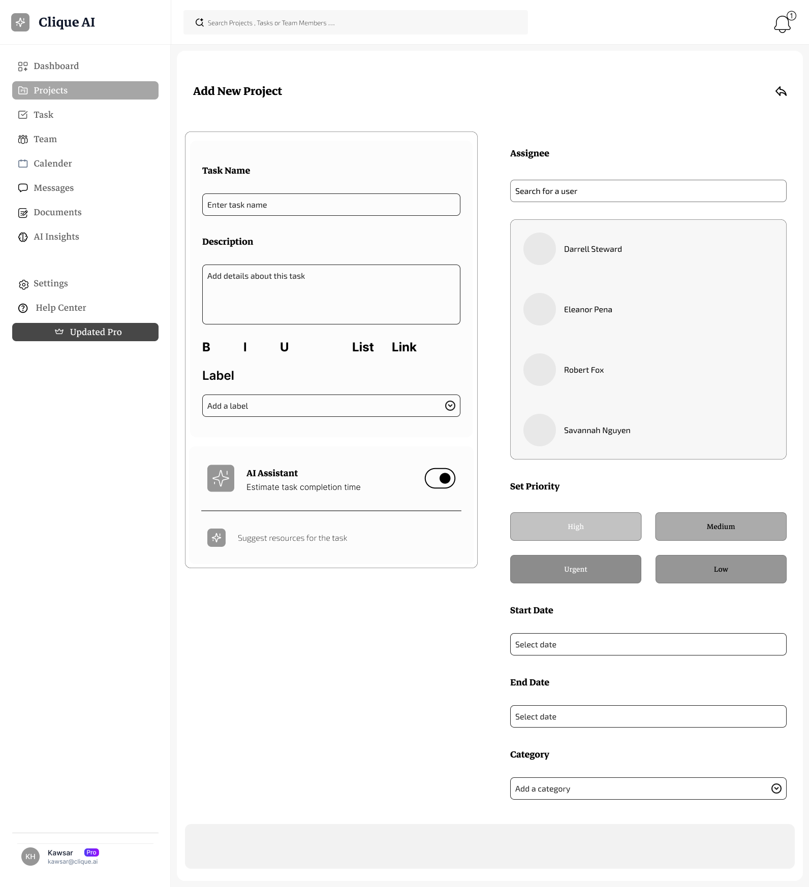
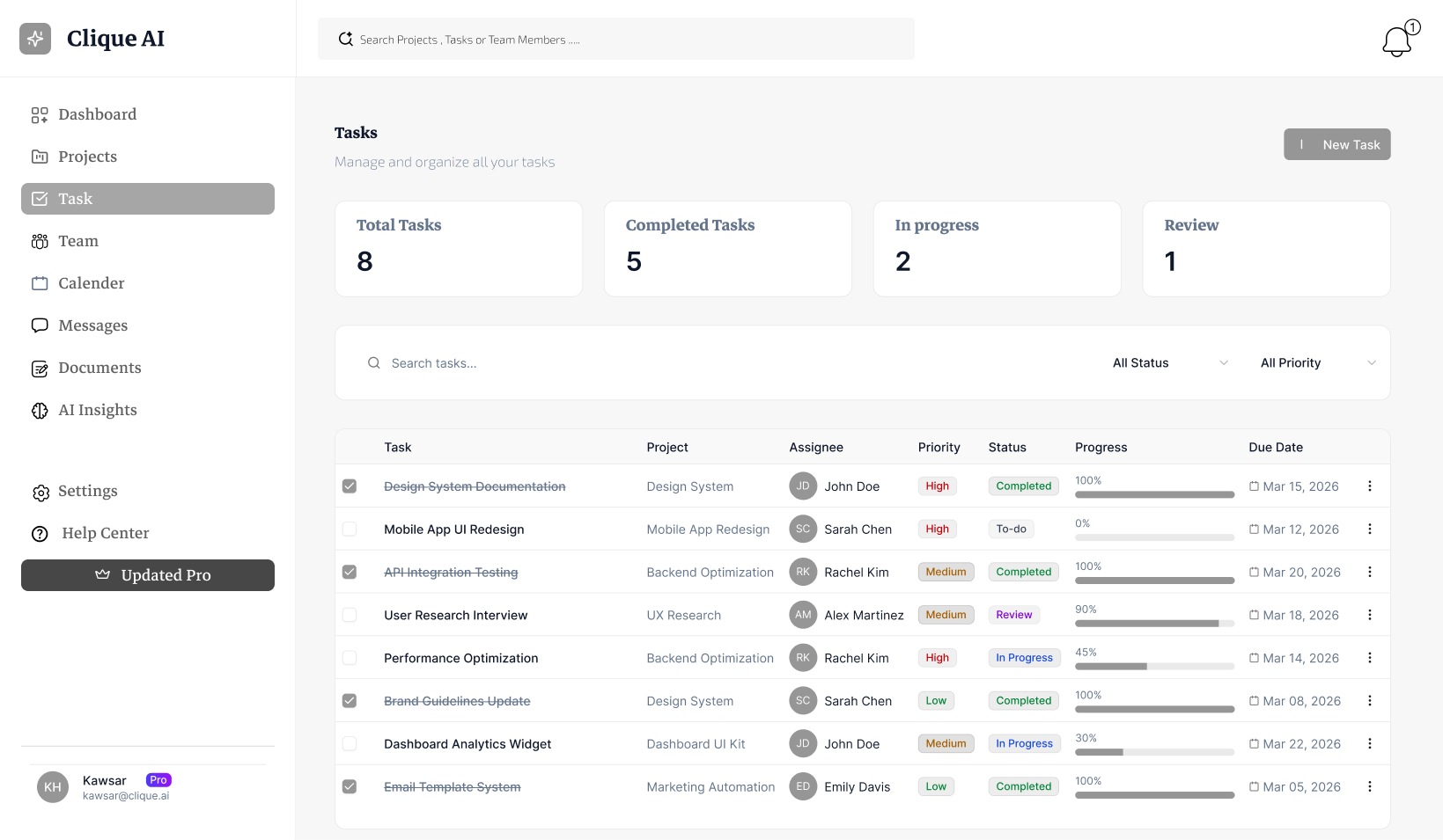
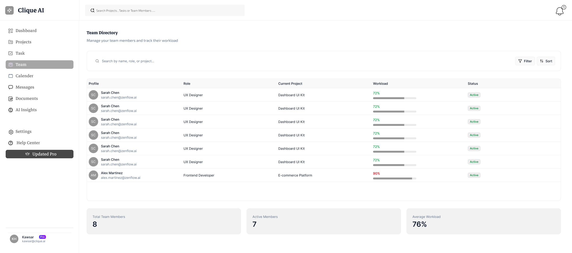
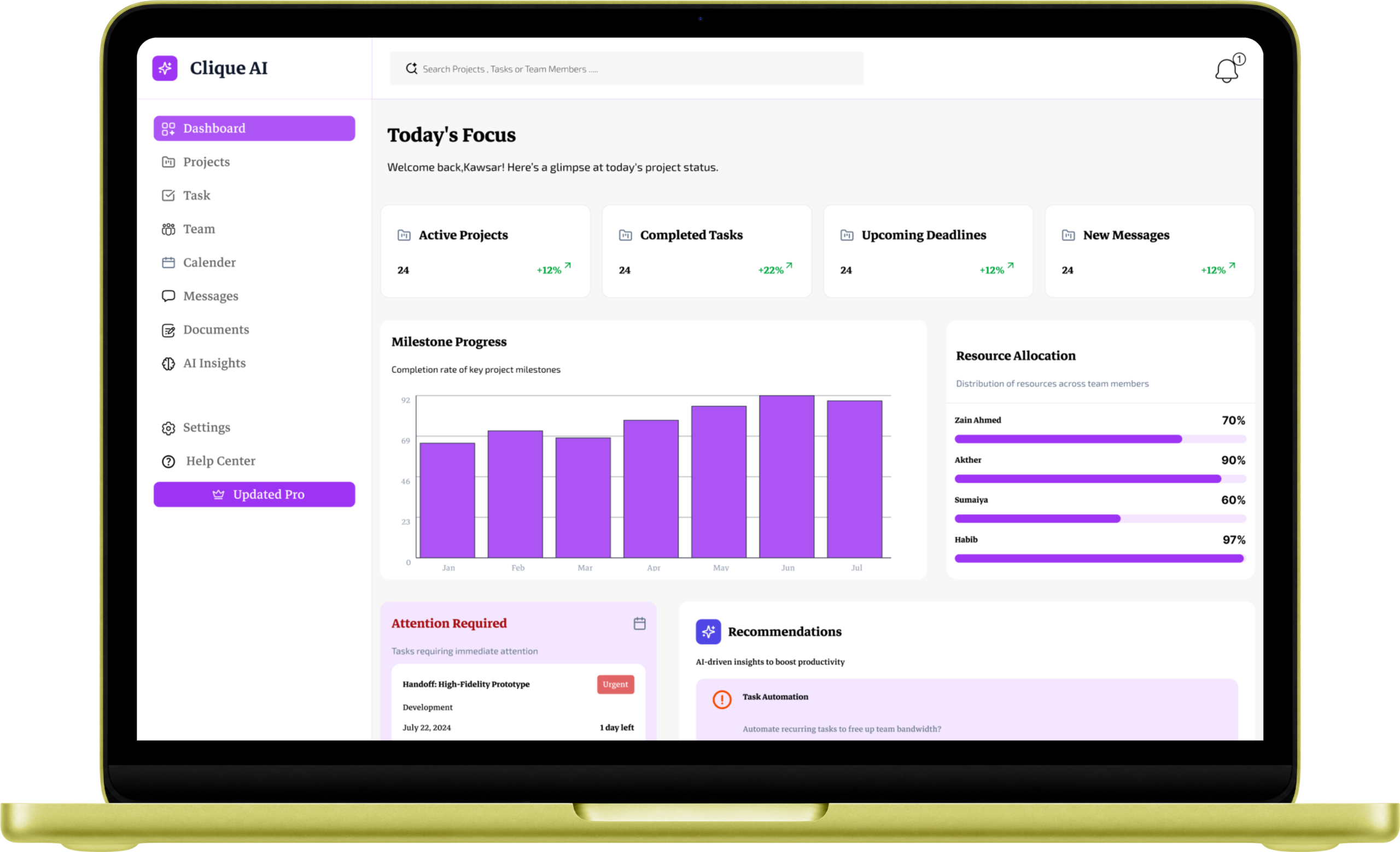
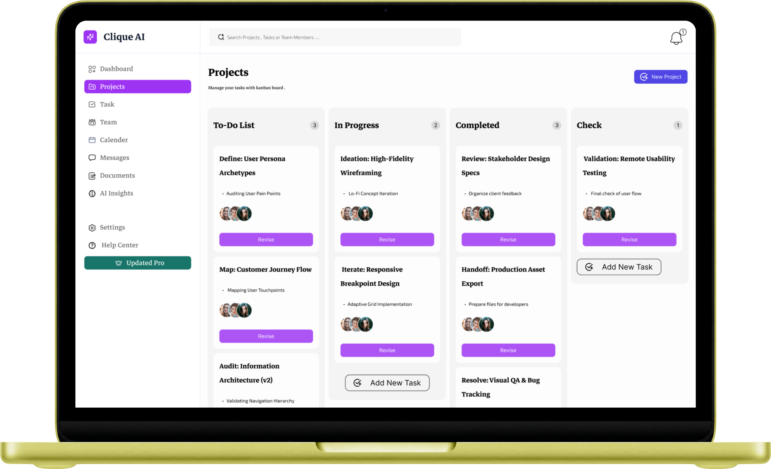
Clique AI is a tool built to help design teams stay organized without the stress. Instead of just being another to-do list, it uses smart technology to show managers exactly what needs their attention right now. It helps teams see who is too busy, which tasks are running late, and how to get projects finished faster.
Problems
Many design teams struggle to stay organized because their tools are too messy and confusing. Managers often have no idea who is overworked or which tasks are falling behind until it’s already too late.
Solutions
My Role
UX designer, UX researcher
My Responsibility
Talking to users to find out what they really need. Sketching out ideas and planning how the app should work. Designing the look of the dashboard using colors and fonts. Building a working model (prototype) to show how people can move through the app. Testing the design with real people to make sure it is easy to use.
UNDERSTANDING THE USERS
User Research
I started by digging deep into our users' habits to uncover what they truly need from a delivery app.
Pain Points
I pinpointed the exact moments where shoppers get frustrated or stuck during their current routines.
Persona
I built a realistic user profile to ensure every design choice remained focused on our target audience.
Empathy Map
I mapped out our users' emotional journey to better understand what they think, feel, and do while ordering.
USER RESEARCH
I started by talking to 5 people who manage design teams to see what makes their jobs difficult. At first, I thought they just needed a better to-do list. However, I quickly learned that their real problem was 'information overload'—they had too much data and didn't know what was actually important. This research changed my plan; instead of just listing tasks, I focused on building an AI that highlights only the most urgent items.
PAIN POINTS
PERSONA
EMPATHY MAP
COMPETITOR ANALYSIS
INFORMATION ARCHITECTURE
USER FLOW
MOSCOW TECHNIQUE
STARTING THE DESIGN
User Research
I started by digging deep into our users' habits to uncover what they truly need from a delivery app.
Pain Points
I pinpointed the exact moments where shoppers get frustrated or stuck during their current routines.
Persona
I built a realistic user profile to ensure every design choice remained focused on our target audience.
Empathy Map
I mapped out our users' emotional journey to better understand what they think, feel, and do while ordering.
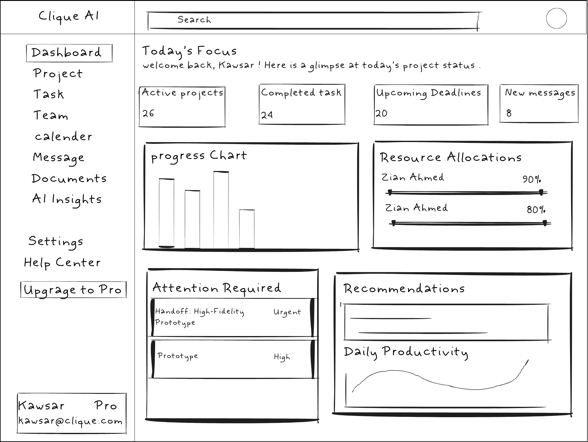
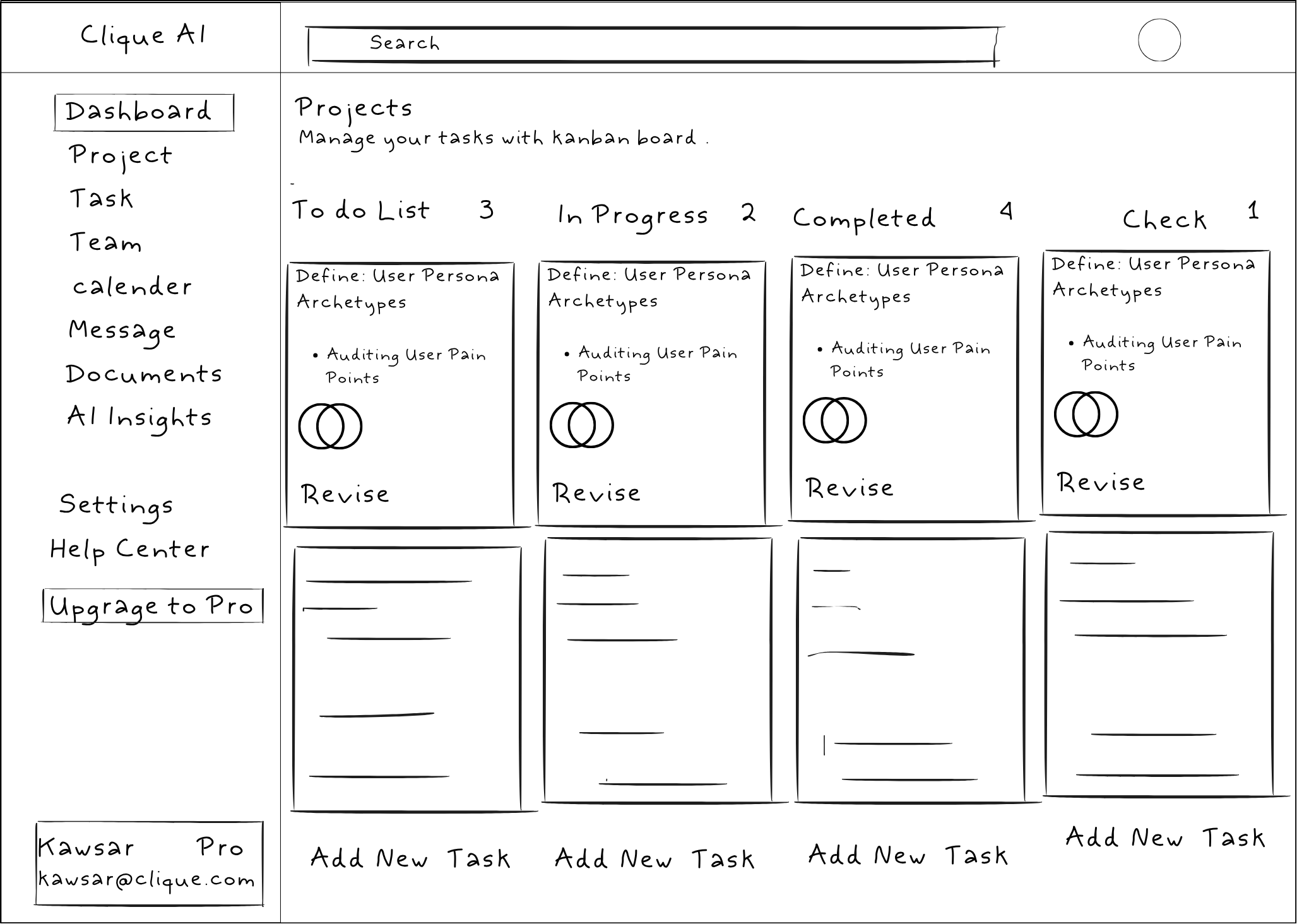
PAPER WIREFRAMES
DESIGN SYSTEM
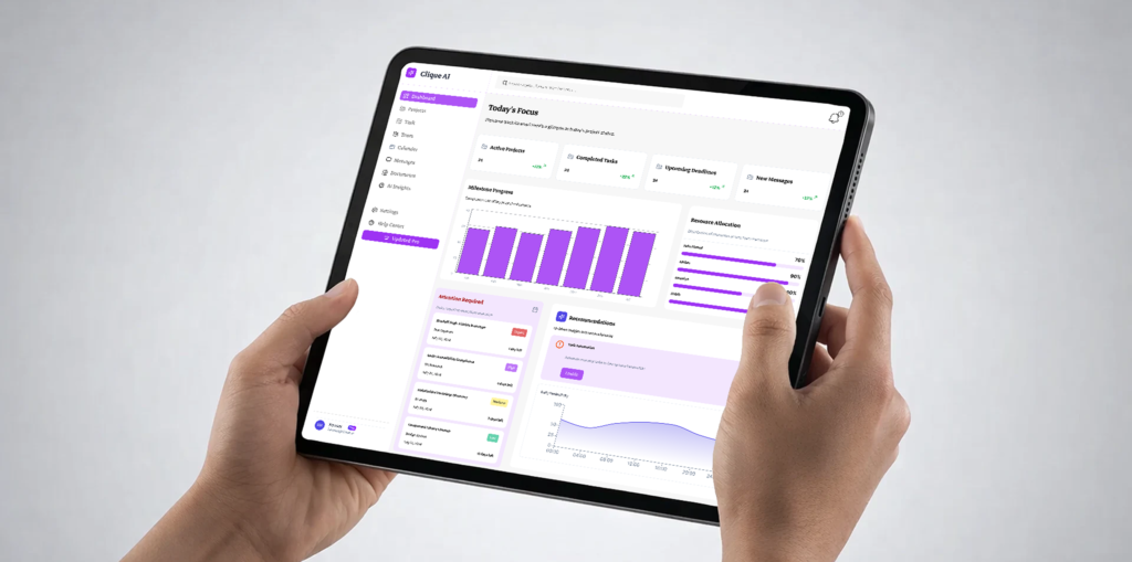
DIGITAL WIREFRAME
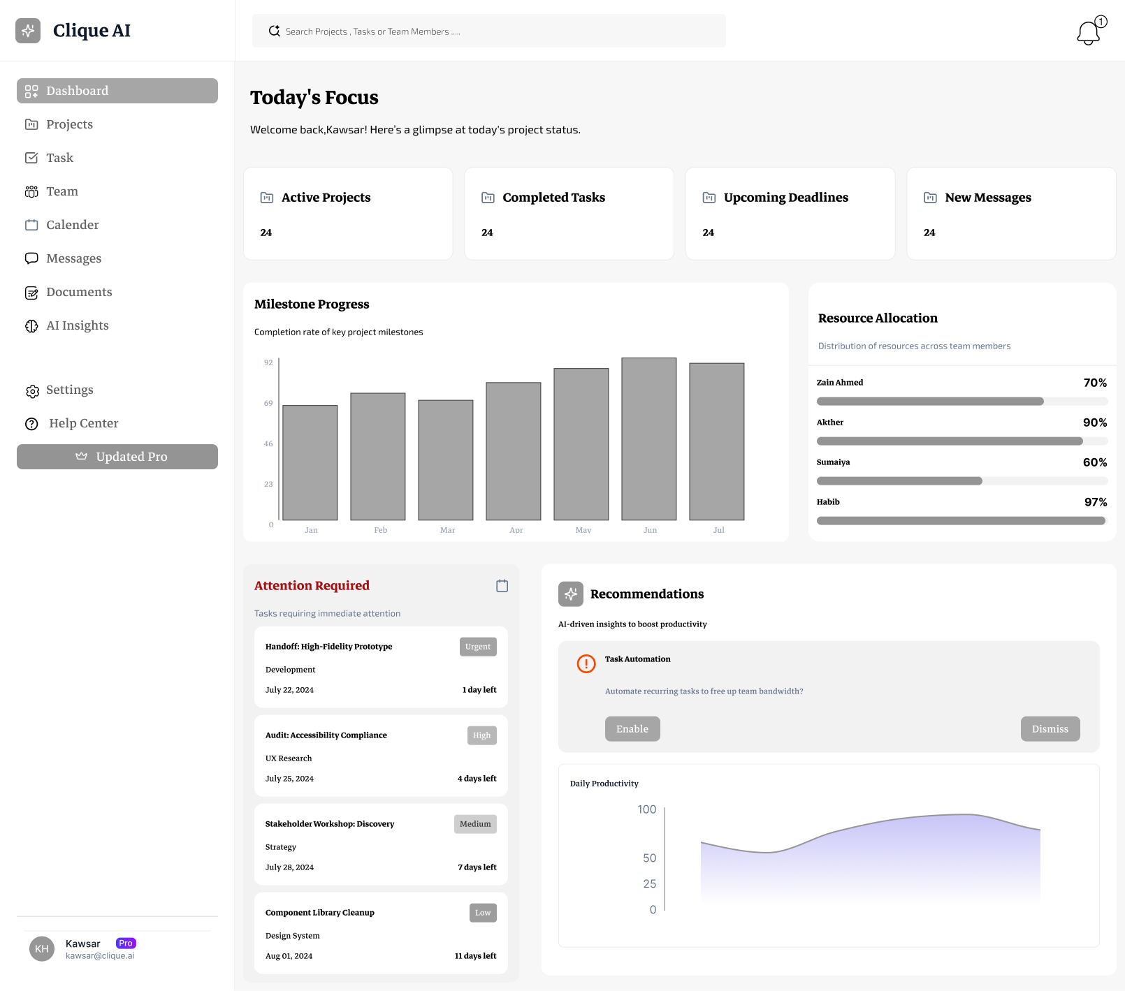
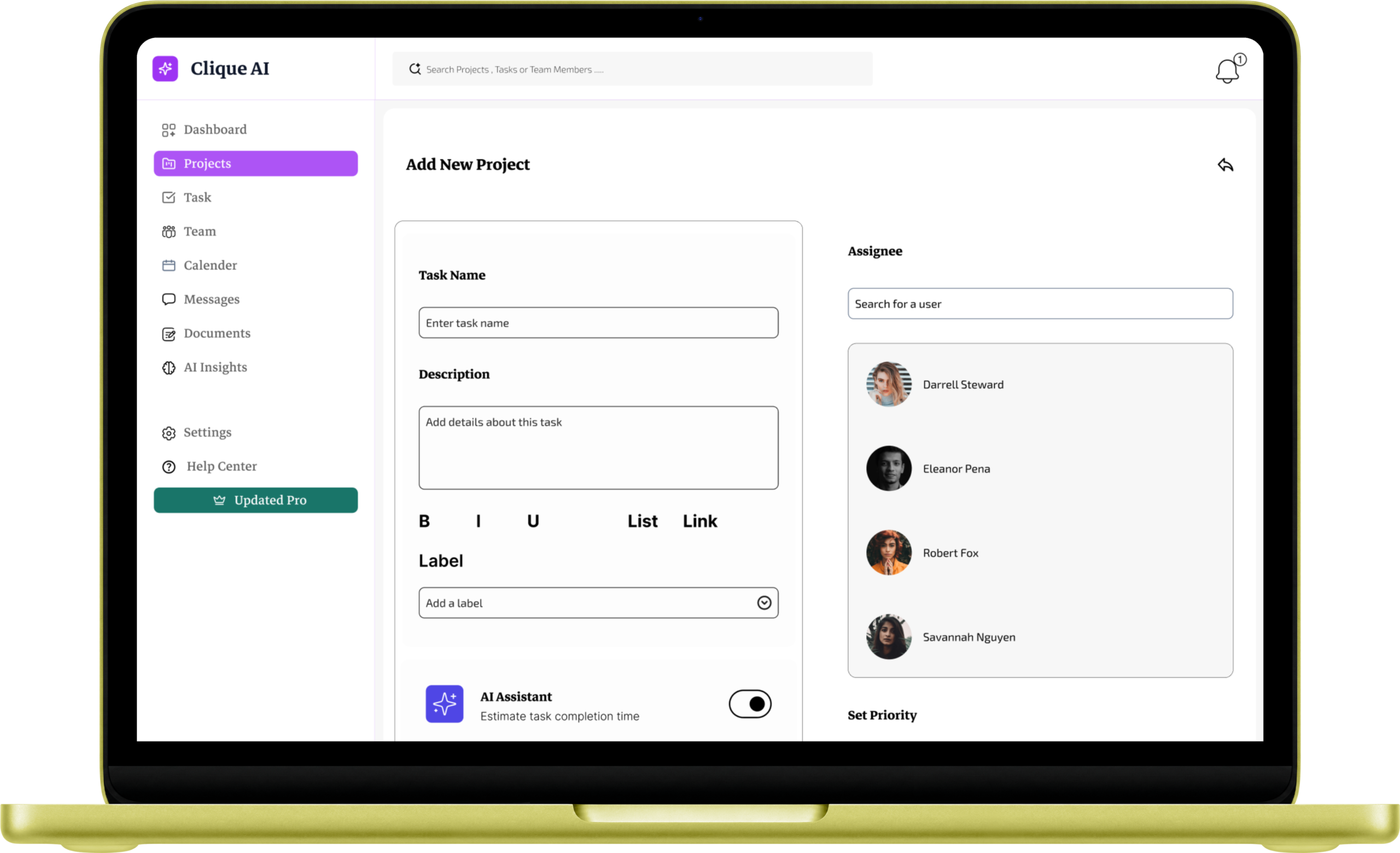
MOCKUPS
PROTOTYPE
USABILITY TESTING
IMPACT & TAKEAWAYS
Impact
By focusing on AI-powered summaries, I created a tool that saves managers hours of manual work. Early feedback showed that users felt much more in control of their day because the app told them exactly where to start.
What I Learned
This project taught me that ‘less is more.’ I learned that the best way to help busy people isn’t to give them more data, but to give them better answers. I also learned how important it is to design for everyone by keeping accessibility at the heart of my work.